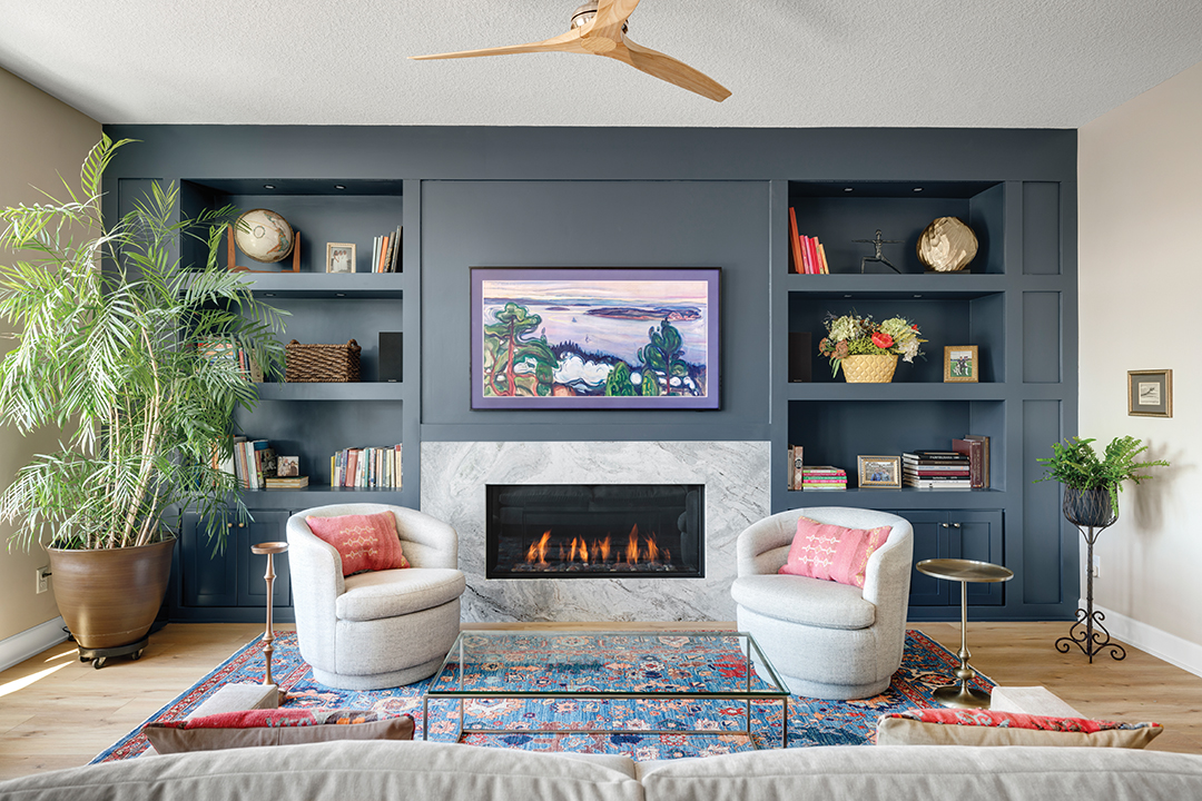
Designer Sara English of Ispiri says color blocking, like the one seen in this home, is the perfect way to jump into incorporating color into a room. Photo: Spacecrafting
An in-depth look at popular social media paint trends that spotlight bold, saturated colors.
Have you visited a friend’s home recently and seen a room that’s monochromatic, maybe painted in a moody hue like dark blue or deep green? Perhaps, there’s a rug in the same color, or the floor and ceiling have been painted all in the same tone to make the space feel cohesive and cozy. This trend is called “color drenching,” and we asked Edina design experts to give us a crash course in how to pull off the aesthetic, whether you’ve been eyeing it on Instagram for a while or just discovered the movement. We also talked about the difference between color drenching and its close cousin, color blocking—what are some scenarios where you’d want to use one or the other? Let’s open up the can of paint.
Color Drenching
Angela Valentine Chaffee, owner of Edina-based Valentine Design, is seeing the color drenching trend grow in popularity for her clients. “It’s kind of timeless and really easy to incorporate in any style of home whether you’re modern, traditional or contemporary,” Chaffee says. Typically, a color-drenched room has all the walls painted the same color, plus the trim and baseboards, and maybe the ceiling and floor, too.
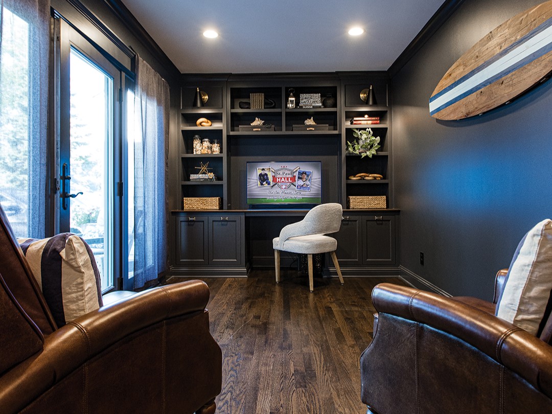
Color drenching example by Angela Valentine Chaffee. Photos: Chris Emeott
A key guideline for color drenching is to use it in smaller, less “busy” spaces of the home. Chaffee says, “Color drenching gives the room a calm, tranquil feeling. It’s perfect in a den, bathroom or nursery.” In larger spaces—kitchens are a great example—there can be too many lines where the eye goes, from cabinets to countertops to light fixtures. For those larger, busier rooms, stick to using deep, bold colors as accents instead. “Color drenching makes a room feel bigger,” she says. “It gives it almost an infinite feeling.”
Sara English, a designer at Edina’s Ispiri, agrees that drenching is best used in smaller spaces. “Powder bathrooms, mudrooms and laundry rooms are perfect spaces to add a dark and moody twist with black, dark green or darker blue shades,” English says. But don’t dismiss light hues for use in color drenching, too—to brighten a space, drench with off-white, beige or pink.
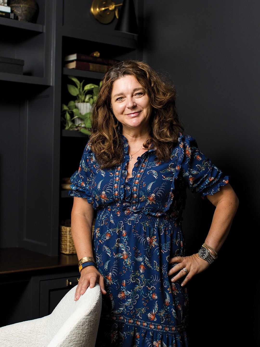
Angela Valentine Chaffee
Color Blocking
So what about color drenching’s relative, color blocking? This design trend has been popular for over a decade and typically involves using a bold color on one wall—or part of a wall—to draw the eye. “You can take it a step further and add a second color,” Chaffee says. “Maybe, you make a diagonal line through a whole wall and then paint the bottom triangle a different color.” She recommends choosing a complementary color—that’s one on the opposite side of the color wheel—for the second part.
“Color blocking can require a lot of painter’s tape,” Chaffee says. “You can make circles or triangles and really take it to an extreme. I’d say ‘art’ is a good word for color blocking because that’s kind of what it feels like.”
Despite how chic those bold colors look on social media, moving away from neutrals can still feel tricky for folks. “Many clients still want to stick with a classic look, but color is becoming more prominent,” English says. Color blocking, starting with a single wall, can be a great way for hesitant homeowners to dip a toe into the colorful pool.
Valentine Design
612.360.8284
Facebook: Valentine Design LLC
Instagram: @_valentinedesign
Pinterest: Valentine Design Angela Valentine Chaffee
Ispiri
5009 France Ave. S.; 952.900.3503
Facebook: Ispiri Design Build Renovate
Instagram: @ispiri.designbuild
Pinterest: Ispiri Design-Build-Renovate

